Jason L. Gohlke
Graphic Designer
Portfolio: Everything else
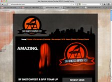
7/2010: San Francisco Improv Festival

In 2010, one of my friends from work was among the organizers of the San Francisco Improv Festival. That summer, I helped them launch a new website. They came to me with a nice-looking site designed by another designer; however, its rudimentary HTML/CSS implementation made it impossible to actually use with any realistic amount of content. (It was designed with transparent layers and a stationary background.)
I reworked the HTML template from scratch while maintaining as much of the original design as possible, built a new WordPress theme around it, and launched it; they were able to use this site effectively in 2010 and 2011, and into 2012. Visit the site.
Thanks for visiting the February 2012 version of my portfolio. (I have additional work I have done for CLCV, including the organization's current collateral materials, that I can show as printed samples, or may add to a more extensive version of this site.) For more:
- Just in case you came to this page first, see my work for CLCV and for the Brainwash Movie Festival.
- For examples of work from previous jobs and my student years in Madison, feel free to visit the 2004-2005 version of my portfolio.
- Be sure to view this portfolio site on a variety of devices. (Caveat: I've only had a chance to test it on a variety of desktop browsers on MacOS and Windows, at a range of widths, an iPhone, and a Kindle Fire -- but not yet on other phones or tablets.)
- Finally, don't forget to peruse my resume.
More about the making of this site: I designed it to be optimized at virtually all screen widths, designing it for mobile browsers first and other browsers after that. I used TypeKit, HTML 5 (with a great debt to Jeremy Keith and everyone at A Book Apart, A List Apart, and An Event Apart [I've been to two], especially my long-time gurus Jeffrey Zeldman and Eric Meyer), and the "Mobile First" and "Responsive Design" strategies used by many, including Luke Wrobelewski and Joni Korpi, with a hat tip to Aaron T. Grogg.
I will also convert these long flat files into a WordPress theme, but I wanted people to see this much first. I know the perfect is the enemy of the good, but so is the mediocre.