Jason L. Gohlke
Graphic Designer
Portfolio: California League of Conservation Voters
12/2011: Event Design
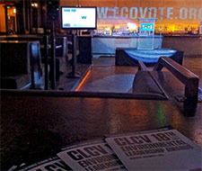
CLCV holds two fundraising galas each year, one in northern California and one in the south. Typically the initial design concept (typography, motif, color scheme) is created by a freelance designer; from that basic foundation, I lay out motion graphics and printed materials. Ads for the event program are generally provided by the event sponsors, but I design ads for sponsors who provide only text and/or photos. Here are several pieces from the most recent event:

Back bar animation: throughout the bulk of the event, this animation was projected on the wall behind the bar in the back of the room at about 12 feet wide. This was created under a very tight deadline.
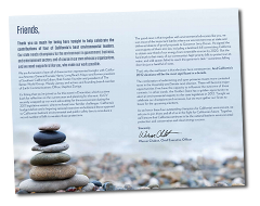
Event program: I laid out and copy-edited this multi-page, 5.5" x 8" booklet, which was distributed at the venue.
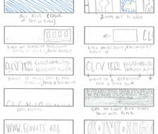
Back bar animation storyboard: I sketched out this quick storyboard before jumping into Flash to create the animation.
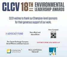
Sponsor recognition poster: The venue had built-in frames for 30" x 40" posters on either side of the main exit; this poster was placed in both for maximum sponsor recognition.
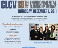
This section of the CLCV website was designed to fit within the existing template and navigation while maintaining the look and feel of the event.
4/2011: CLCV Education Fund Website
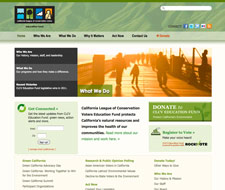
After CLCV's major website overhaul in 2010, the CLCV Education Fund (CLCVEF, CLCV's 501(c)(3) sister organization) requested a new site as well. CLCV retained Fenton Communications to design and build a new site in Drupal. (More about that process later.) Following that, using a few weeks of staff time, I single-handedly created the (much smaller) CLCVEF site in WordPress (with a bit of jQuery), basing the design on CLCV's site without making it too similar. I was able to avoid some CSS problems that currently plague the CLCV site, however. View the live site.
Print advertising
I frequently am called on to design a variety of pieces, with shelf lives from a few hours to many years, on relatively short notice. These are among the advertisements I've created for CLCV, intended for either external publications or internal event journals.
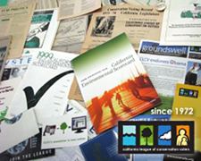
11/2010: Going into CLCV's 40th year, I conceived, photographed, and laid out an ad that suggested CLCV's long and influential history in California, using an image of a wide range of historical publications. This ad has been used in CLCV and national LCV event programs. See a JPG or PDF version of the ad.
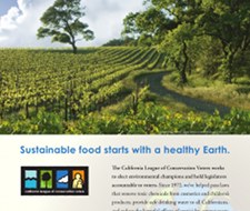
2/2011: Edible Communities magazines aim to connect consumers with local growers, retailers, chefs and food artisans in more than 60 localities across the country. The publisher of the then soon-to-launch edition in Orange County contacted me to solicit a full-page ad that they would place for no charge in the magazine's premiere issue. I designed the ad and wrote the copy, tailoring it to its specific audience. See a JPG or PDF version of the ad. It appeared on page 27 of the Early Spring 2011 issue of Edible Orange County magazine.
CLCV identity graphics
I also occasionally design logos for CLCV programs and entities.
10/2009: CLCV was moving their major donor program from an event-based model to an annual giving model. The development department requested a visual identity for the new annual giving program. The resulting mark, while unique, is clearly visually related to CLCV's existing identity. Check out the identity usage guidelines I created and a few other options I presented.

1/2006: CLCV created "Green California", a program that aimed to create a common agenda for environmental groups in Sacramento, based on a model pioneered by other state leagues. I was asked to quickly create a "temporary identity" that persists more than six years later. See a larger version of the identity.
CLCV web graphics
The current version of the CLCV website, designed in 2009-2010 by Fenton Communications, has a flexible system for presenting featured content on the home page. Here are a few of the graphics I've created for those areas.


I've also created my share of graphics for CLCV's email organizing activities. Here is a recent message; I designed the template (specifically to be a very simple reference to CLCV's current website) as well as the call-out graphic (in about half an hour).
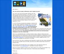
I also was the primary copy writer for this particular message. (Since I've been spending so much time on back-end and design stuff, and we have an online organizer on staff, I haven't done much writing lately; I was picked to write this one specifically because of my years of experience writing about CLCV's work.)